Blog
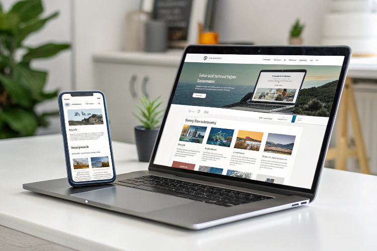
Responsive Web Design: Why It’s Essential in 2025.
Web Development & Design ▪ 2025-03-07
In the digital era, having a website that adapts seamlessly across various devices is no longer a luxury—it’s a necessity. With a growing number of users accessing websites on smartphones, tablets, and desktops, responsive web design (RWD) has become a crucial factor in user experience and SEO rankings. As we move into 2025, businesses that fail to prioritize responsiveness will struggle to compete in an increasingly mobile-driven world.
This blog explores the importance of responsive web design, its benefits, and best practices to ensure a seamless user experience in 2025.
What is Responsive Web Design?
Responsive web design (RWD) is a design approach that ensures a website dynamically adapts to different screen sizes and resolutions. This is achieved through flexible layouts, fluid grids, and media queries that allow content to be displayed optimally, regardless of the device being used.
The Growing Importance of Responsive Web Design in 2025
1. Mobile-First Indexing is a Priority
Google has been prioritizing mobile-first indexing since 2019, meaning it primarily uses the mobile version of a website for ranking and indexing. By 2025, mobile-first indexing will be more critical than ever, and websites that are not optimized for mobile will see a decline in search rankings.
2. Rising Mobile Internet Usage
According to recent statistics, over 60% of global internet traffic comes from mobile devices. With the rise of 5G and improved mobile networks, users expect fast, seamless browsing experiences on their phones. A non-responsive site can drive away mobile users and increase bounce rates.
3. Better SEO Performance
Google favors responsive websites because they enhance user experience. Sites with high engagement rates, fast loading speeds, and lower bounce rates tend to rank higher in search engine results.
4. Enhanced User Experience (UX)
User experience is at the core of digital success. A responsive website ensures users can navigate effortlessly, read content without zooming, and access features easily, leading to higher engagement and conversion rates.
5. Cost-Effective Maintenance
Having a single responsive website eliminates the need for multiple versions for different devices (e.g., a separate mobile site). This reduces maintenance costs, improves efficiency, and ensures a consistent brand experience across all platforms.
Key Benefits of Responsive Web Design
1. Improved Accessibility
A responsive site ensures that users with different devices and screen sizes can access and interact with your content without frustration.
2. Faster Page Load Speed
A well-optimized responsive design improves page load times, especially on mobile devices. Faster websites provide a better user experience and reduce bounce rates.
3. Higher Conversion Rates
Seamless browsing experiences encourage users to stay longer and take desired actions, such as making a purchase, filling out a form, or subscribing to a newsletter.
4. Reduced Bounce Rate
When users encounter a non-responsive website, they are likely to leave quickly. A responsive site keeps users engaged, reducing the bounce rate and increasing dwell time.
5. Future-Proofing Your Website
As new devices with varying screen sizes emerge, responsive web design ensures your site remains functional without needing redesigns for each new device.
Best Practices for Responsive Web Design in 2025
1. Use a Mobile-First Approach
Since most users access websites on mobile devices, start designing for smaller screens first, then scale up for larger screens.
2. Optimize Images and Media
Use scalable vector graphics (SVGs) and compress images to ensure they load quickly without compromising quality.
3. Implement Flexible Grids and Layouts
Utilize CSS frameworks like Bootstrap or CSS Grid to create fluid, adaptive layouts that adjust seamlessly to different screen sizes.
4. Utilize Media Queries
CSS media queries allow you to apply specific styles based on the device's screen width, ensuring an optimal viewing experience across devices.
5. Prioritize Touch-Friendly Elements
Ensure buttons, links, and navigation elements are large enough and properly spaced for touch interactions on mobile devices.
6. Optimize Typography for Readability
Use legible font sizes and scalable typography to enhance readability on all devices.
7. Minimize Load Times
Reduce HTTP requests, enable browser caching, and use content delivery networks (CDNs) to improve site speed and performance.
8. Conduct Cross-Device Testing
Regularly test your website on different devices, screen sizes, and browsers to identify and fix any usability issues.
The Future of Responsive Web Design
As we move forward, responsive design will continue to evolve. Here are some trends shaping the future of web design:
1. AI-Powered Web Design
Artificial intelligence (AI) is playing a growing role in web design, with AI-driven tools automating responsive design adjustments for better performance.
2. Progressive Web Apps (PWAs)
PWAs offer an app-like experience within a browser, combining responsiveness with offline functionality and push notifications.
3. Voice Search Optimization
With the rise of voice search, responsive websites must adapt to accommodate voice-friendly navigation and content structuring.
4. Dark Mode Compatibility
Many users prefer dark mode for better readability and reduced eye strain. Future-responsive designs will integrate dark mode settings seamlessly.
5. Advanced Personalization
Websites will leverage AI and machine learning to deliver personalized experiences based on user behavior and preferences.
.png)